It’s just a poster, so what?
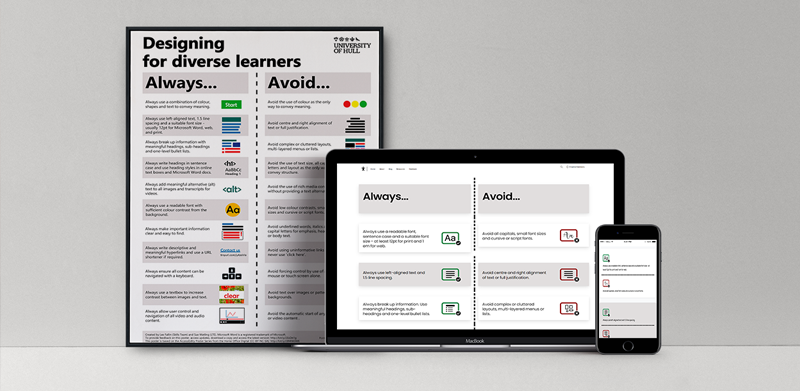
I’d seen the Designing for Diverse Learners poster pinned to colleagues’ walls, shared on Twitter, and referenced on institutional websites and VLEs (Virtual learning environments). Over the past six months, the poster has been downloaded 417 times with over 2,804 views from just one repository – It’s fair to say it was popular, but why? Accessibility guidance is abundant on the web, so why was this resource so well received? What was it about the poster that resonated with people? On reflection, it seemed that the poster did three things exceptionally well.
1) Present salient points clearly.
2) Does not burden the reader with technical complexity.
3) Does not assume a deficit/shortfall with the reader.
In my view, the third point is critical. So much information on accessibility takes an adversarial stance. “You are doing this wrong”, “you should know this”, and “people can’t access your material” – Whilst all this may be true, this doesn’t necessarily motivate change. A subtle, but important element of the poster is that it is unthreatening. It doesn’t assume competence – it demonstrates good practice, seemingly without judgement.
The challenge.
After discussing a laundry list of ideas, three priorities were identified for the update.
1) The guidance should be available in HTML – PDFs are great, but not necessarily for small screens.
2) Was the guidance still relevant and up to date?
3) Underpinning context should be provided for each guideline.
Points two and three seemed like the obvious starting place. The keen-eyed may have noticed some of the guidelines have merged (in keeping with present salient points clearly). There has also been an addition – Always use accessibility checkers where available. Lee would frequently get asked “why should text be aligned left?” So, if we could expand on each guideline, that would also be useful.
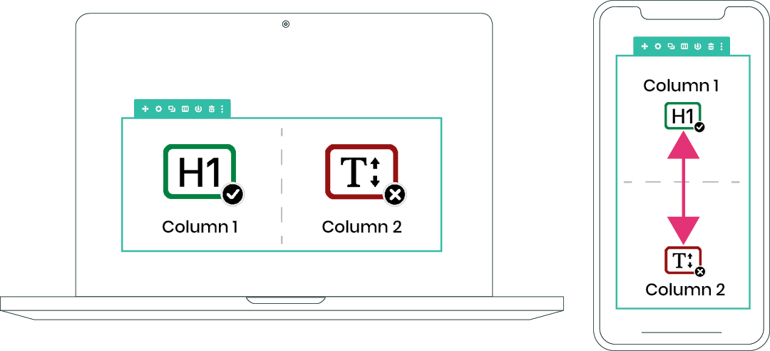
Two columns into one.
Next came a long and frustrating experimentation period. The challenge was to keep the essence of the poster that has proved so popular but make it responsive for different screen sizes. This boiled down to one crucial point- what was the best way to present two columns on a mobile?
Although we arrived at a solution, this didn’t stop me from trying to re-invent the wheel and produce some elaborate alternatives. If you’re interested in seeing some of these design prototypes, you can head over to the D4DL graveyard and take a look.
Design Prototype
Always use a combination of colour, shapes and text.
Left-aligned text and use a suitable font size.
Break up information with meaningful headings.
Write text in sentence case and use heading styles.
Provide multiple means of representation.
Always use a readable font with sufficient colour contrast from the background.
Make important information clear and easy to find.
Write descriptive and meaningful hyperlinks.
Ensure all content can be navigated with a keyboard.
Allow users to control and navigate audio and audio content.
As the final design began to take shape, other niceties appeared. SVG icons (you can scale these to the size of a building, and they remain pixel perfect) and a subtle hover effect on the always elements for emphasise. After many revisions, I am still not 100% happy with the result…but nor should I be. Design is a constant process of iteration and improvement. The priority is making a good working version available – a minimum viable product that has the potential to be improved through community feedback, sharing ideas and development.
Designing for Diverse Learners: A new dawn - Dr Lee Fallin
[…] This release broke free from the confines of a PDF/poster into a fully dynamic, online website. These changes make the resource as accessible as possible for users while providing a responsive design to maximize device compatibility. This is all while retaining the original always/avoid instructions in a split format. My favourite piece of Tom’s handy work is how the resource scales, maintaining two columns for large screen and print – but switching to cards on smaller screens. Tom has written up a more detailed account of this transformation in his recent blog post. […]